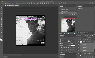
First Album cover draft
For my album cover I am going to design it with the genre; R&B in mind. I have made up an artist and an album title etc. I am taking my own photos and then manipulating them on Adobe Photoshop and Lightroom. The target audience is 17 - 22 year olds so I want to make something that appeals to that demographic. In order to understand what my album cover must contain to achieve this, I have to look at other pieces of artwork to help me get a better understanding of what it is I need.
Inspirations
After researching modern R&B album artworks I came across two in particular, that had caught my attention. I found the retro style photos appealing and the text that came with both of them really complimented the style and as a result reflected not only the songs but the artists very accurately.
The first one was by an Artist called Khalid from the album American Dream.
 After going through the editing process of the photo in Lightroom, I then imported the file to photoshop where I cropped it into a square. I then made a white boarder on the outside using the box tool. After I took the text and placed it at the bottom in grey. I used the font Helvetica with all capitals and wide spacing to give it the slick look. I then added the title 'Recognise' at the top and duplicated it twice with different colours to give the retro effect on it - kind of like the Khalid album. I then added the parental advisory label on it as most R&B is explicit and it made sense to.
Inspirations
After researching modern R&B album artworks I came across two in particular, that had caught my attention. I found the retro style photos appealing and the text that came with both of them really complimented the style and as a result reflected not only the songs but the artists very accurately.
The first one was by an Artist called Khalid from the album American Dream.
I took inspiration from the font at the top and the overall composition of the artwork. The way it's spaced is very particular and has clearly been thought out very carefully.
The second one was by an artist called Trey Songs from the album Tremaine.
This album made me start to see the prominent style of text in R&B. So I took this idea and incorporated it into my own.
The making of:
 After going through the editing process of the photo in Lightroom, I then imported the file to photoshop where I cropped it into a square. I then made a white boarder on the outside using the box tool. After I took the text and placed it at the bottom in grey. I used the font Helvetica with all capitals and wide spacing to give it the slick look. I then added the title 'Recognise' at the top and duplicated it twice with different colours to give the retro effect on it - kind of like the Khalid album. I then added the parental advisory label on it as most R&B is explicit and it made sense to.
For the back cover, I went for the same feel but without the artist on it. I also blurred the image to draw the main focus on the tracks while still containing the main themes. of the album. I also added the record label.
The Final first draft:


Comments
Post a Comment